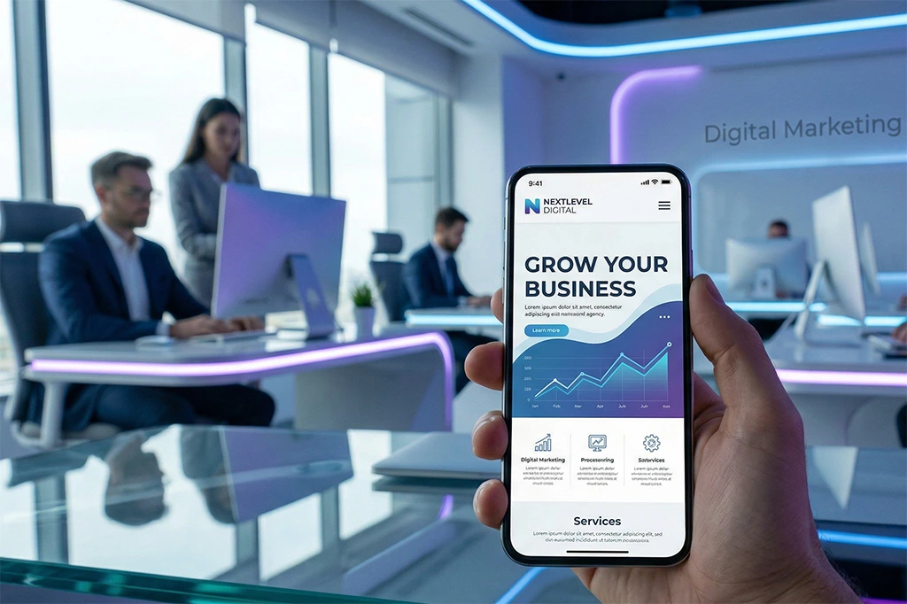
If your website is not optimized for mobile users, you are already losing potential customers, traffic, and sales every single day.
In this blog, we will explain why every business needs a mobile-first website in 2026 and how it directly impacts your growth.
A mobile-first website is a design approach where the website is created primarily for mobile devices first and then adapted for tablets and desktops.
Instead of shrinking a desktop site to fit mobile screens, mobile-first design focuses on:
- Fast loading speed
- Simple navigation
- Responsive layouts
- Touch-friendly element
1. Mobile Traffic Dominates the Internet
Most users now access websites through smartphones. From shopping to booking services, everything happens on mobile.
👉 If your site is not mobile-friendly, users will leave immediately.
2. Google Prioritizes Mobile-First Indexing
Google now uses mobile-first indexing, which means:
- Google ranks your mobile site first
- Poor mobile experience = lower ranking
- Better mobile UX = higher SEO ranking
3. Faster Loading = More Sales
Mobile-first websites are optimized for speed:
- Faster loading time
- Reduced bounce rate
- Higher conversion rate
Even a 1-second delay can reduce conversions significantly.
4. Better User Experience (UX)
A mobile-first website provides:
- Easy scrolling
- Readable fonts
- Simple menus
- Quick access buttons
This improves user satisfaction and trust.
5. Higher Conversion Rates
When users find it easy to browse and take action:
- They fill forms faster
- They contact you easily
- They purchase more confidently
👉 Result: More leads and sales.
6. Desktop-Only Websites Are Losing Value
If your website is only designed for desktop:
- It looks broken on mobile
- Users leave quickly
- You lose business opportunities
In 2026, this is a major disadvantage.
7. AI + Mobile Experience is the Future
With AI-driven search and voice assistants:
- Mobile-friendly websites perform better
- Structured content is easier to read and rank
- AI tools prefer responsive designs
Key Features of a Mobile-First Website
- Responsive design
- Fast loading speed (under 3 seconds)
- Sticky call-to-action buttons
- Click-to-call and WhatsApp integration
- Simplified navigation menu
- Optimized images and code
- SEO-friendly structure
Benefits for Business Owners
- Increase online visibility
- Get more customer inquiries
- Build trust and brand image
- Reduce bounce rate
- Improve Google ranking
- Increase revenue
Google Mobile Friendly Test:
https://search.google.com/test/mobile-friendly
You can test your website using Google’s Mobile-Friendly Test tool.
 Post on LinkedIn
 Post on X